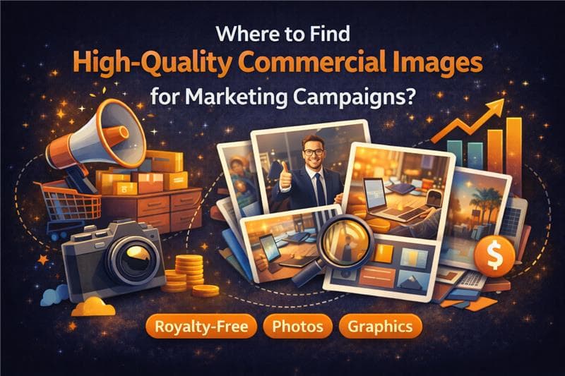
Introduction – The Real Problem
In modern marketing, visuals aren't just an accessory; they are often the first—and sometimes only—interaction a potential customer has with a brand. Yet, after years of working in this industry, we have observed a consistent frustration among marketing teams and business owners: finding images that look professional is easy, but finding images that actually work in a commercial campaign is surprisingly difficult.
We often see marketers struggle with libraries full of "moody" or "artistic" photography that looks beautiful in a gallery but fails completely when placed behind a headline or a Call-to-Action button. The struggle usually isn't a lack of options; it is a lack of usable options.
The most reliable way to find high-quality commercial images is through carefully curated libraries that prioritize resolution, usability, and licensing clarity—not just visual appeal.
Finding the right visual asset requires looking beyond the subject matter and understanding technical composition. In this blog, we answer this question by sharing what actually works, based on real marketing needs we’ve observed.

Why Commercial Image Quality Matters
It is easy to think of images as decoration, but in a commercial context, they are communication tools. When we analyze why campaigns underperform, poor visual selection is frequently a contributing factor.
From our experience, high-quality commercial imagery builds immediate trust. When a user lands on a website or sees an ad, they make a subconscious judgment about the brand's legitimacy within milliseconds. Grainy, poorly lit, or generic stock photos can signal a lack of professionalism, creating friction before the customer even reads a single word.
Furthermore, "visual noise" is a significant issue we encounter. An image might look stunning on its own, but if it is too cluttered, it distracts from the core marketing message. High-quality commercial images support the narrative; they don’t fight for attention against it.

What Makes a High-Quality Commercial Image
We have spent a long time evaluating what separates a "nice photo" from a "commercial asset." It rarely comes down to artistic preference. Instead, it comes down to three practical factors.
Resolution & Campaign Compatibility
In the digital age, flexibility is key. We have seen countless campaigns stall because an image looked great on a mobile phone preview but pixelated the moment it was stretched for a desktop website header or a printed banner.
A true commercial-quality image must have a high enough resolution to be cropped, zoomed, and resized without losing integrity. Marketers need the freedom to use the same asset across a Facebook ad and a trade show booth without quality degradation.
Color Accuracy & Brand Safety
While heavy filters and oversaturated colors are popular on social media, they can be a nightmare for brand consistency. We advise looking for images with balanced, realistic lighting and natural tones.
Why? Because natural lighting is easier to overlay with brand colors or adjust during the design process. An image that is already heavily edited limits what a designer can do with it later.
Composition & Usability
This is perhaps the most overlooked aspect of sourcing images. In our internal reviews, we always look for "negative space"—clean, uncluttered areas within a photo where text or logos can be placed.
A photograph of a desk setup is useless to a marketer if every inch of the frame is filled with objects. A high-quality commercial image intentionally leaves breathing room, allowing the marketer to place their message clearly without it getting lost in the background.

Image Needs Based on Marketing Use Cases
Different channels require different visual strategies. Here is what we have found effective for specific platforms:
Social Media Campaigns
On social feeds, the goal is to stop the scroll. However, clarity is still king. Images here need a central focal point that is instantly improving. We find that simple, bold compositions perform better than complex scenes that require the user to squint to understand what is happening.
Website Headers and Landing Pages
This is where landscape orientation and negative space are critical. We often see designers struggling with vertical images that simply don't fit the horizontal nature of a web header. The best images for this use case have a clear subject on one side and an open background on the other for the headline.
Product and Brand Promotions
When promoting a specific product or service, the background image needs to be subtle. It should provide context (lifestyle vibes, office settings, nature) without competing with the product being sold. Low-contrast textures often work best here.
Common Mistakes Marketers Make
Even with good intentions, we see marketing teams fall into the same traps repeatedly.
- Ignoring Commercial Usage Rights: This is the most dangerous mistake. Just because an image is free to download doesn't mean it is safe for a commercial ad. Verifying that an image has a clear license for commercial use is non-negotiable.
- Stretching Images: We frequently see low-resolution images forced into high-resolution spaces. It immediately lowers the perceived value of the brand.
- Overpowering the Message: Choosing an image because it is "cool" rather than because it fits the layout often leads to unreadable text and confused customers.
How Wallpezia Fits Into the Solution
Based on how we organize and review images at Wallpezia, we realized early on that volume doesn't equal value. A database of a million unusable images helps no one.
Our approach has always been centered on the "designer’s eye." When we curate images, we aren't just looking for good photography; we are looking for marketing assets. We screen for the technical specs—resolution, lighting, and composition—that allow a marketer to download a file and use it immediately without spending hours fixing it in post-production.
We believe that finding a safe, high-resolution image shouldn't be a gamble. It should be a predictable part of your workflow.
Final Thoughts
Images are powerful tools, but like any tool, they need to be fit for the job. We encourage you to look at your current visual assets not just as pictures, but as functional parts of your sales funnel.
By prioritizing resolution, checking for negative space, and ensuring your licensing is secure, you can stop worrying about your visuals and focus on the message you want to deliver.
If you want to understand image usage rights before downloading, check our Commercial License Explained Simply guide.


